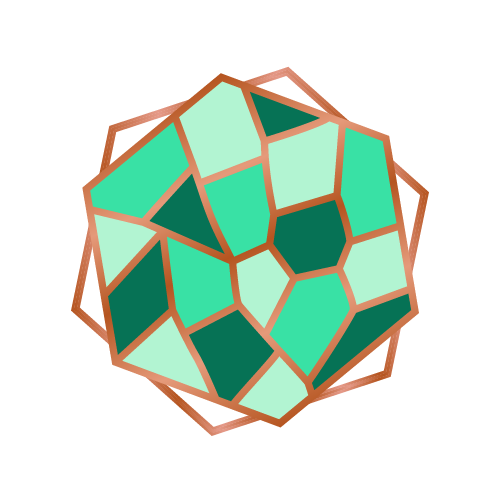
Each person is free to see what they like in my logo and I’ve had lots of weird and wonderful comments about it (turtle, football, Rubik’s cube, gem, diamond, …).
For those of you curious to find out, here is the story behind my logo.
Designing my logo myself was important to me. I wanted it to illustrate what coaching means to me, as well as showing a bit of my personality and the palette of colours I love. I am very creative and I like to seek beauty in everything. I also love the idea of conveying a message through creativity.
Following a brainstorming session with a friend, throwing ideas around, my logo appeared to me in a dream the following night, so I grabbed a piece of paper as soon as I woke up and started drawing. The logo then got to its professional finished look thanks to my graphic designer Jade Latour.
Here is the meaning behind my logo.
The mosaic
I was born in Chartres, France, a city with a cathedral with stunning stained-glass windows and also the city of the naive architect Picassiette who collected broken ceramic and glass pieces his whole life to decorate his entire house with. I have always loved mosaic and the idea of collecting individual pieces of various shapes, colours and sizes to create a beautiful mash-up!
The double hexagon
The hexagon is the shape of France, it is also a shape which can be looked at from different sides and perspectives. Coaching is about getting a new perspective on things (your situation, yourself, …).
The double off-set hexagon gives the idea of movement, moving forward. It’s what coaching is about, springing into action to overcome challenges and achieve what you want in life.
The colours
My friends will tell you that I have been obsessed with shades of greens for years and for more than 10 years, it’s been mainly teal green. I also love copper and have a few copper objects to add some hints of sparkle to my green interior.
The copper lines
I love the Japanese art of Kintsugi which consists of mending broken ceramics by embellishing them with gold resin or lacquer lines to join the broken pieces together. The philosophy behind it is to embrace what is flawed and imperfect, make it even more beautiful and draw attention to it with gold. For my logo, the lines had to be copper rather than gold.
My vision of coaching
To me, this is what we are, every single one of us has different facets to their personality, with their singularities and imperfections. The different cultures, people, challenges and experiences we have encountered have helped shape who we are today.
We can choose to embrace all of our pieces and rearrange our personal mosaic to get our best fit, using our emotions and weaknesses as strengths, finding our area of excellence, fully embracing who we are and living the life we want, with all that we are, being ourselves, unapologetically.
